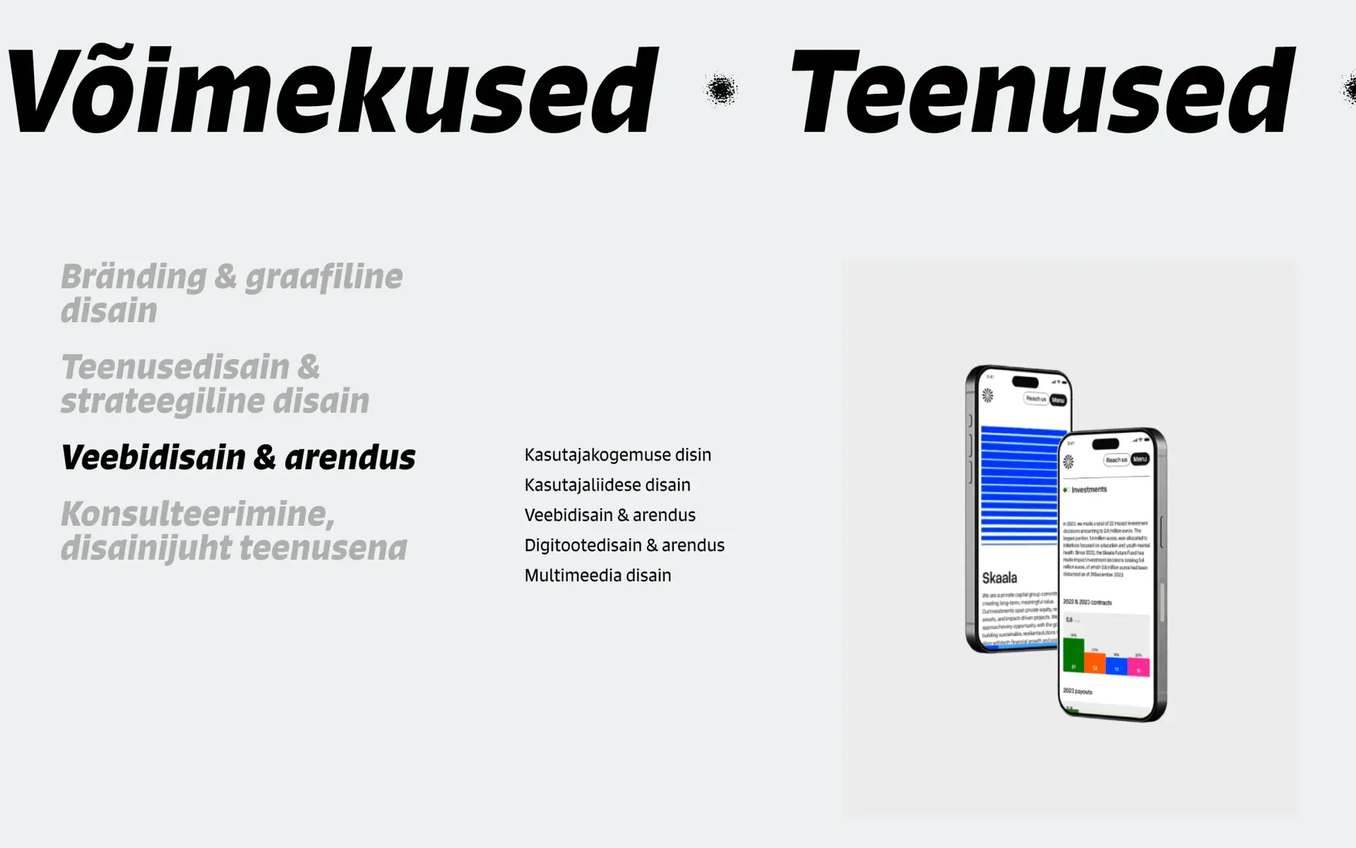
During my internship at the Estonian’s leading design agency, I got to redesign their own website. The purpose of this wasn’t to rebrand the agency but to give it a fresh new look and feel. Since the agency has been around over 20 years, it has established its name and branding. Tuning their infamous yellow colour and introducing new textures, gave the website a new breathing.
CLIENT: Velvet Design Agency
DESIGN: Gabriella Tarja & Grete Hints (mentor)
YEAR: 2025
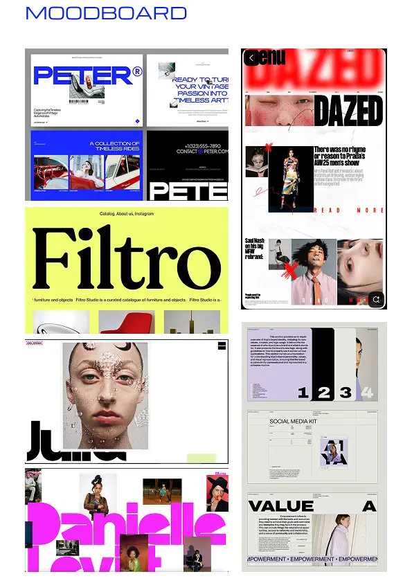
inspiration
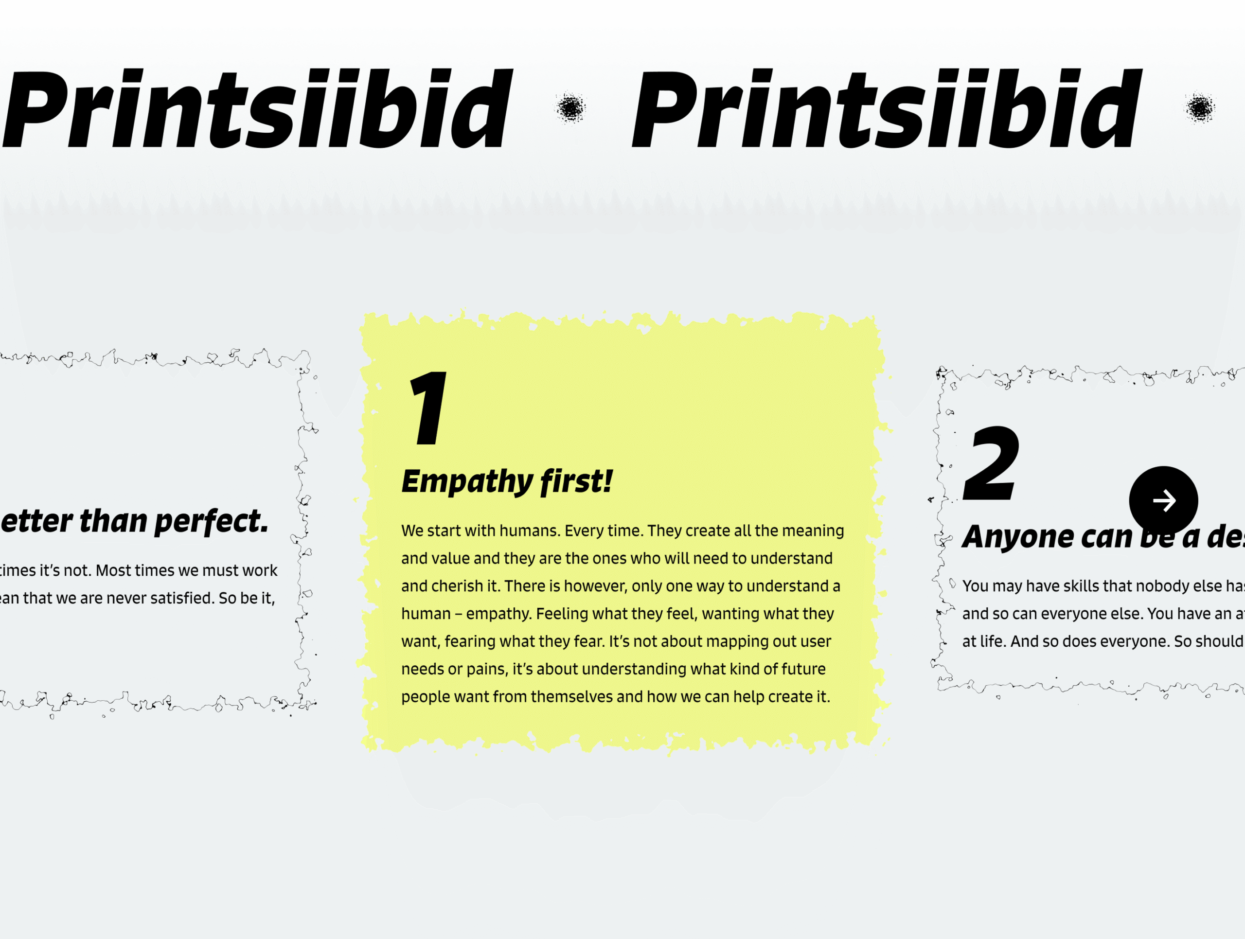
01
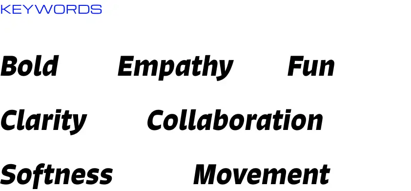
Velvet is bold. They are good at what they do and they aren’t afraid of showing that. The agency’s tone of voice is straightforward and genuine. With big “in your face” text, I wished to pass on their even bigger character.
new elements
02
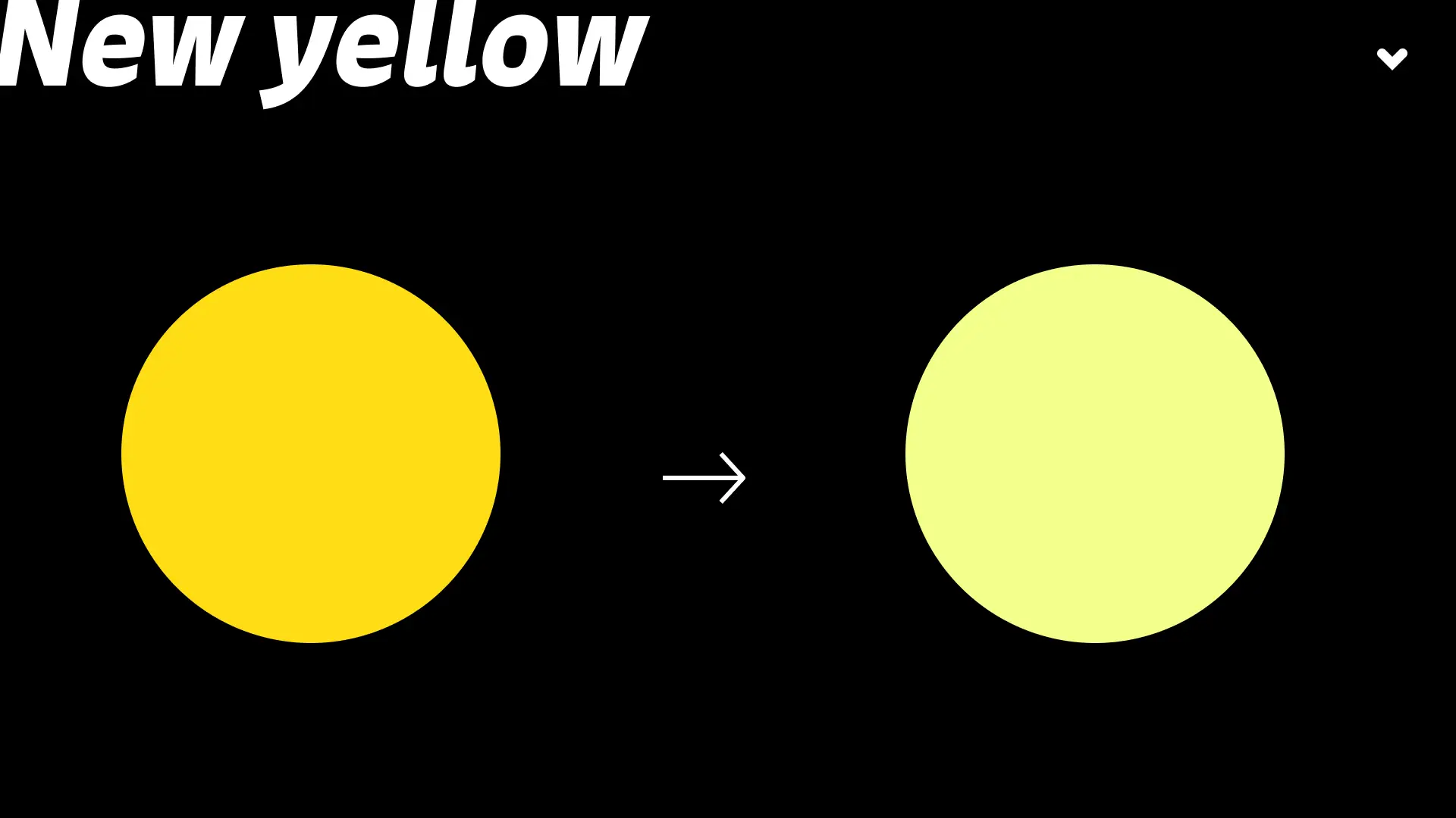
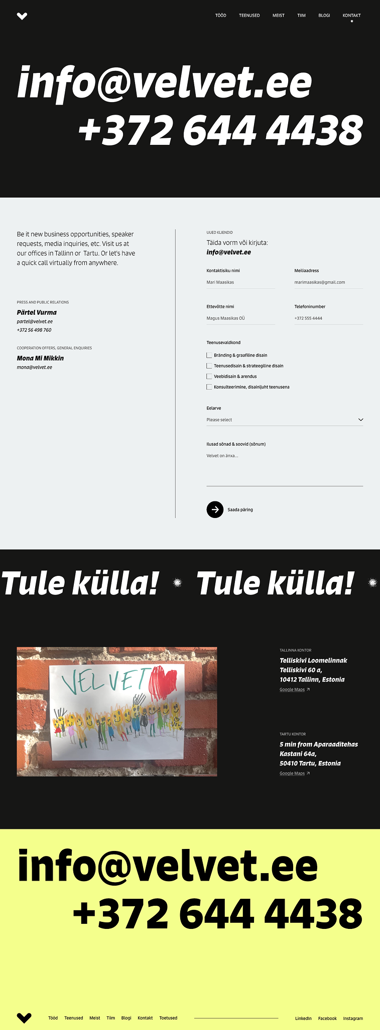
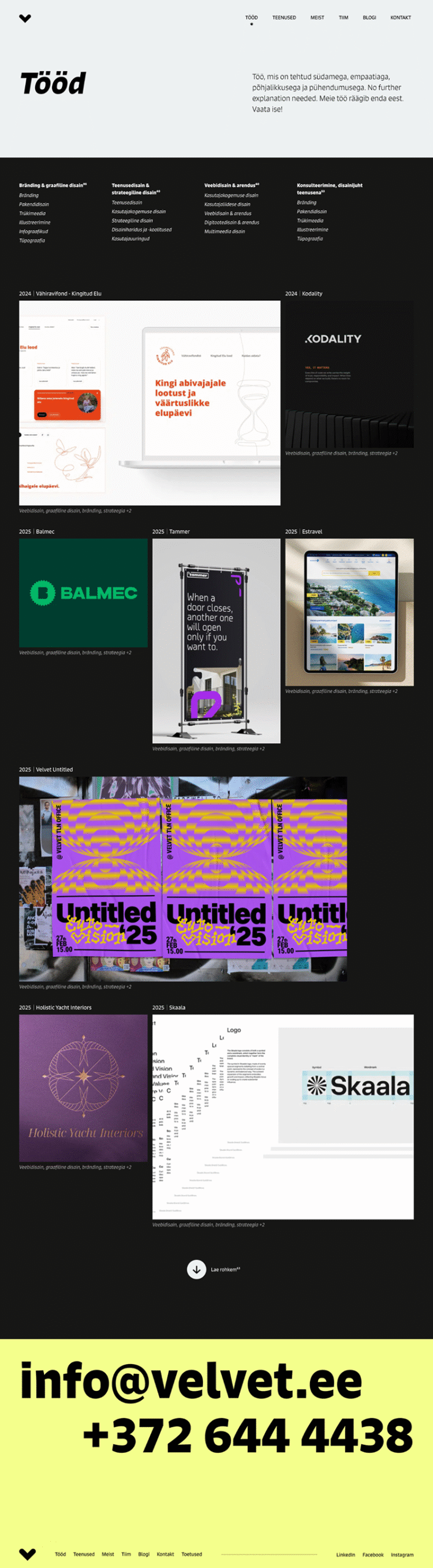
COLOUR
Changing the yellow from this egg yolk colour to more lighter but brighter shade, the visual of the site feels more fresh and contemporary.
TEXTURE
Since the agency’s name is Velvet (what actually means corduroy in Estonian), I wanted to implement some kind of soft texture into the UI to represent their empathic and warm essence of the people working there.